Box model
Every container is a box that consists of content area, paddings, borders and margins:
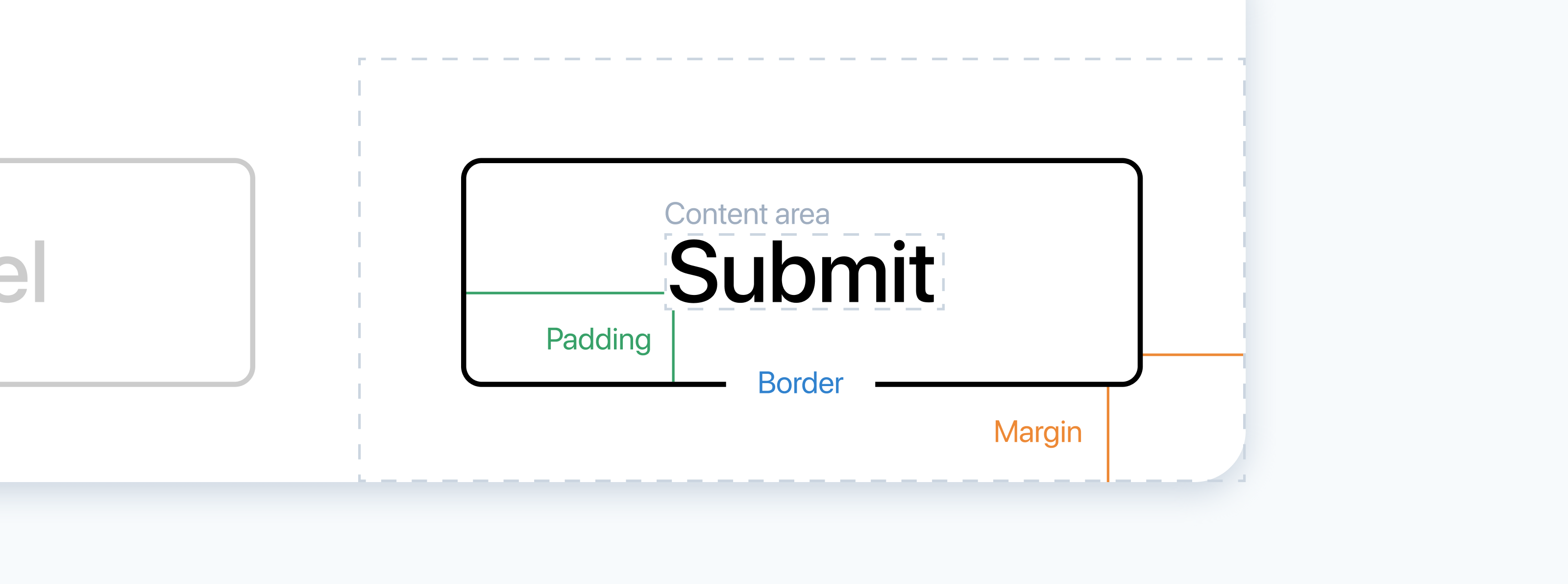
- Content area is where text and images appear.
- Padding is the inner space between content area and border.
- Border is the line between padding and margin created with the
borderproperty. - Margin is the outer space between border and another container.
Padding
Padding is the space around the content area. The padding area is filled with background (if a container has one) and it responds to interactions like hover and click. Paddings can be specified with four properties:
<button style="padding-top: 8px;
               padding-bottom: 8px;
               padding-right: 32px;
               padding-left: 32px;">
  Click
</button>
The code above creates vertical and horizontal space between “Submit” and the border:
There’s also a shorthand property, padding, that allows you to specify values for all sides:
<button style="padding: 32px 8px 32px 8px;">
  Click
</button>
The order goes clockwise starting with top: top, right, bottom, left.
If the vertical and the horizontal values are the same, as in the example above, you can shorten the style further:
<button style="padding: 32px 8px;">
  Click
</button>
First value specifies the top and the bottom paddings, and the second value specifies the right and the left ones.
If you need the same paddings on all sides of a container, you can enter a single value:
<button style="padding: 12px;">
  Click
</button>
Margin
Margin is the space between the container’s border and another container. The margin area is not filled with background even if a container has one, and it does not respond to interactions like hover or click.
The margin property has the same system of shorthand values as padding:
/* separate properties */
margin-top: 2px;
margin-bottom: 2px;
margin-left: 8px;
margin-right: 8px;

/* shorthand property */
margin: 2px 8px 2px 8px;

/* vertical and horizontal values */
margin: 2px 8px;

/* one value for all sides */
margin: 12px;
The margin is useful for creating space between two elements with borders or backgrounds:
Some tags in html, including body, have default margins. If you want a container to take full width of the page using width: 100vw, you should go to the CSS section and reset margins of the body tag to 0:
body {
  margin: 0;
}
Width and height
The width and the height properties allow you to specify the size of a container:
<div style="width: 200px;
            height: 200px;
            padding: 24px;
            background-color: #eee">
</div>
By default, width and height specify width and height of the content area only. Even though the width property of the container above is set to 200px its actual width is 248 pixels, because two paddings—24 pixels each—are added to the sides.
A special property, box-sizing, allows you to avoid all those complex calculation. When you add box-sizing: border-box; to a container, whatever you specify in the width property becomes the actual width of the container. With this style, the size of the border and the paddings will be included in width:
<div style="width: 200px;
            height: 200px;
            padding: 24px;">
  <!-- content -->
</div>
<div style="box-sizing: border-box;
            width: 200px;
            height: 200px;
            padding: 24px;">
  <!-- content -->
</div>
You can also add this style to body and the universal selector, so widths and heights are calculated the easy way for all elements in your prototype:
body, * {
  box-sizing: border-box;
}
Universal selector
In CSS, you can apply styles to all elements in a prototype using *, a universal selector. It is often used to overwrite the default styles, like applying proper sizing using box-sizing: border-box; and clearing the margins and the paddings values using margin: 0 and padding: 0.
max-width and max-height
Sometimes you need to define width using relative values, like % or vw, so a container adjusts to the width of the screen. For example, you create a container that takes the full width of its parent:
<div style="width: 100%;">
  Lorem ipsum dolor sit amet consectetur...
</div>
This layout works fine for smaller and medium-sized screens, but on bigger screens you run into a risk of making the text hard to read, because the lines become too wide. To prevent the container from expanding beyond a particular size, you can use the max-width property:
<div style="width: 100%;
            max-width: 540px;">
  Lorem ipsum dolor sit amet consectetur...
</div>
If you open this prototype in a new tab and resize the preview panel, you will see that the text takes the full width on smaller window sizes, but stops at a certain width on larger sizes.
Similarly, max-height defines the maximum vertical size of a container.
Practice
Texts
Add paddings to the prototype to improve vertical rhythm:
- Fork your result of task in the Text styles article. You can also fork the prototype from the article.
- Add vertical paddings to all containers. You can either use the shorthand property
padding, or use side-specific value likepadding-topandpadding-bottom. - Add horizontal paddings to paragraphs too.
Note, that the prototype you forked may have pre-defined padding values set for div containers in the CSS section. You can delete those styles if you don’t want to overwrite them.
When you’re done with this prototype, fork your result of the task in the Opacity and shadow article and improve the layout of the card using padding similarly to the way you did this for the article design above.
Buttons
Create a set of buttons using the button tag:
- Fork the starting prototype.
- The
buttontag comes with a lot of styles, likefont-size,background-colorand others. To create custom designs you will need to overwrite most of them. - Try designing buttons using
widthandheight, and alternatively usingpadding. Using paddings is considered to be a more universal approach, but you are free to pick the one you think works best for you. - Use margins to create space between buttons.
- When designing the Ghost and the Pill buttons, notice that they appear 2 pixels higher than, for example, the Primary button even when you apply the same vertical paddings. That is because the border adds pixels to the height of the button. You can either add borders of the same color as the background to the Primary, the Secondary and the Alert buttons, or use smaller vertical paddings in the Ghost and the Pill buttons.
Wireframe
Create a wireframe of a layout with a header and a sidebar:
- Create a container with
heightset to 10vh and a bottom border. - Create another container with the fixed width,
heightset to 90vh, and a right border. - As described in this article, in the Margin section, you need to set the
marginproperty of thebodytag to 0 in the CSS section. Without this, the scrolling will appear, because the total height of the prototype will be 10vh + 90vh + body’s margins. And if the total height is more than 100vh, the scrollbar appears. - As described in this article, in the Width and height section, you also need to set the
box-sizingproperty toborder-boxin the CSS section. Without this, the scrolling with appear, because the total height of the prototype will be 10vh + 90vh + border width. Once again, if the total height is more than 100vh, the scrollbar appears.